Discovering the Most Popular Logo Colors According to Psychological Analysis
— Decoding the Psychological Influence of Logo Colors

When it comes to logo design, color plays a significant role in shaping brand identity and evoking emotions in consumers. A well-chosen logo color can leave a lasting impression and create an instant connection with the audience. In this blog post, you’ll delve into the psychology behind some of the most popular logo colors and how they influence consumer perception.
1. Blue: Instilling Trust and Reliability
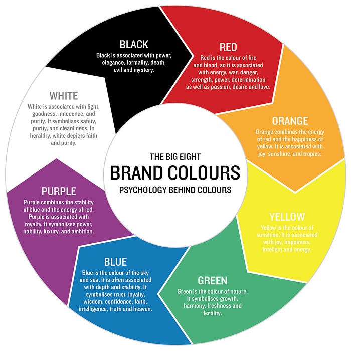
Blue reigns as one of the most popular logo colors across various industries. It is often associated with trust, reliability, and professionalism. Brands like Facebook, IBM, and PayPal utilize shades of blue in their logos, conveying a sense of security and dependability. Blue is also linked to calmness and serenity, making it an ideal choice for companies in the tech, finance, and healthcare sectors.

2. Red: Energizing and Captivating Attention
Red is a bold and attention-grabbing color that exudes energy and excitement. Brands such as Coca-Cola, Netflix, and YouTube have incorporated red in their logos to create a sense of urgency and passion. This color is known to stimulate appetite and impulsive behavior, making it popular in the food and entertainment industries.

3. Green: Symbolizing Growth and Nature
Green is often associated with nature, growth, and sustainability. It conveys a sense of harmony and freshness, making it an excellent choice for eco-friendly and health-conscious brands. Companies like Starbucks and Whole Foods embrace green in their logos to showcase their commitment to environmental consciousness and well-being.

4. Yellow: Eliciting Positivity and Optimism
Yellow is the color of sunshine and is known for its ability to evoke positivity and optimism. Brands like McDonald’s and Snapchat leverage yellow in their logos to create a cheerful and lively brand image. However, it’s essential to use yellow thoughtfully, as excessive use can be overwhelming and cause feelings of caution.

5. Black: Portraying Sophistication and Elegance
Black is a classic and timeless color associated with sophistication and elegance. Brands like Chanel and Adidas opt for black in their logos to evoke a sense of luxury and exclusivity. When used in combination with other colors, black can enhance contrast and create a striking visual impact.

6. Purple: Signifying Creativity and Imagination
Purple is a color that signifies creativity, imagination, and uniqueness. Brands like Yahoo and FedEx embrace shades of purple to portray innovation and a sense of wonder. It is often favored by brands targeting a younger and more creative demographic.

7. Pink: Elegance and Compassion
Pink is a color often associated with femininity, tenderness, and compassion. Brands that incorporate pink in their logos communicate a sense of elegance, sophistication, and nurturing. It has been traditionally used by companies in the beauty, fashion, and healthcare sectors to convey a gentle and caring approach to their products or services.
Lyft, T-MOBILE, and Breast Cancer Awareness.

In recent years, we’ve witnessed a shift in pink’s perception, moving beyond traditional gender associations. Many modern brands embrace pink as a symbol of inclusivity, creativity, and breaking free from societal norms.
8. Orange: Energy and Vibrancy
Orange, on the other hand, is a color of energy, warmth, and vibrancy. It exudes enthusiasm and excitement, making it a go-to choice for brands seeking to create a dynamic and engaging image. Orange logos are commonly found in the food and beverage industry, as it stimulates appetite and generates a feeling of excitement.
Home Depot, Mastercard, and Nickelodeon.

Brands that embrace orange in their logos often aim to spark curiosity and encourage action. It is an attention-grabbing color that can effectively draw consumers’ eyes to a brand’s identity, fostering a memorable and positive association.
The Power of Colors in Logo Design
Choosing the right color for your logo is a critical aspect of brand identity. Each color carries unique psychological associations that can profoundly impact how consumers perceive your brand. By understanding the psychology behind popular logo colors, you can strategically craft a logo that resonates with your target audience, conveys your brand values, and leaves a lasting impression on the market.

Wrapping Up
Remember, there are no strict rules when it comes to logo colors, and creativity is key. Analyze your brand personality, target audience, and industry trends to find the perfect color palette that aligns with your brand vision and objectives. Whether it’s the calm and trust of blue, the energy of red, or the freshness of green, the power of colors can be your most potent tool in creating a memorable and impactful brand identity.
#logodesign #branding #brandstyleguide #brandidentity #marketing #identity
